reduction in design-to-dev handoff time
Enterprise DesignOps · Pattern systems
The Pattern Library
A design-system transformation that unified fragmented enterprise product lines through reusable patterns, semantic tokens, and production-ready components.
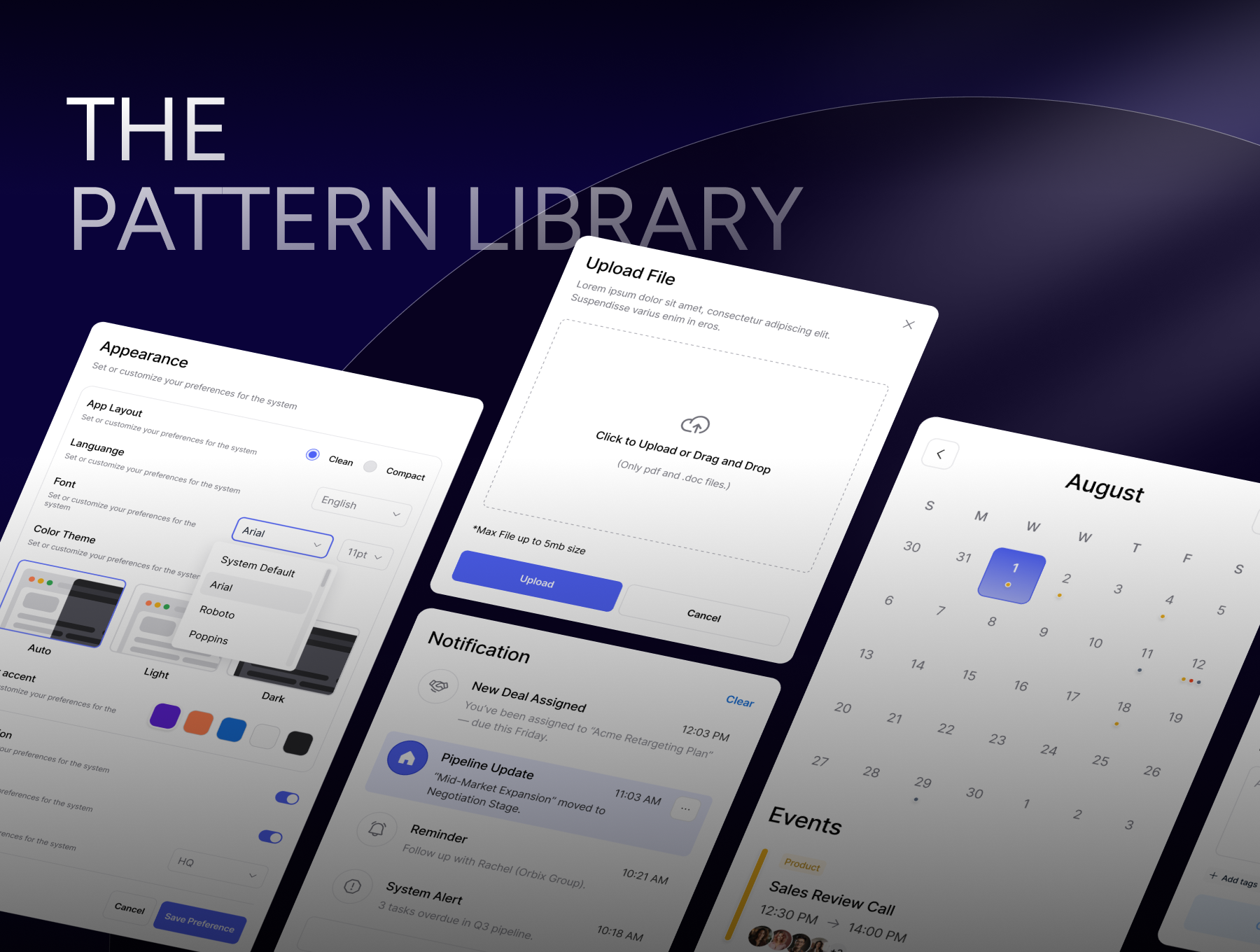
Project overview
How we moved from atomic components to a system for assembling complete enterprise experiences.
Teams had access to a unified design system, but they were still producing inconsistent product experiences. The missing layer was not another button or field. It was a shared pattern language that explained how components should combine into durable, accessible, production-ready workflows.
cross-team adoption across eligible product teams
reusable pattern components and documented variants
enterprise product applications influenced
01 · The challenge
The consistency paradox.
Even with a unified design system, teams were still solving the same interaction problems in different ways. Atomic components existed, but the assembly patterns did not.
Designers rebuilt similar screens and flows differently across related products, creating duplicated effort and inconsistent user experiences.
- Duplicative effort
- Inconsistent patterns
- User confusion
Developers recreated common layouts, workflow components, and edge states because there was no production-ready pattern layer.
- Long development cycles
- Technical debt
- Maintenance burden
“A design system is only as effective as the patterns that govern how its components are assembled. Atomic elements alone do not guarantee consistency.”
02 · Strategic responseThe CRUX Pattern Library became the bridge
The CRUX Pattern Library became the bridge
between component inventory and complete product experiences.
Pattern documentation
Systematic cataloging of interface patterns with usage guidance, accessibility requirements, responsive behavior, and implementation notes.
Component library
Pre-built, production-ready pattern components that reduce rebuild cycles and keep implementation consistent across products.
Design-to-code
Direct translation of Figma patterns to React components with semantic tokens, reducing ambiguity during design handoff.
From UI toolkit to Salt + CRUX
The transformation shifted teams from component access to pattern confidence.
Atomic parts without assembly guidance
- Teams solved the same problems differently
- No bridge between design intent and production code
- Inconsistent experiences across related products
- Accessibility requirements repeated manually
Documented patterns with clear composition rules
- Shared pattern language reduced redundant work
- Semantic tokens enabled consistent visual decisions
- Production-ready React patterns accelerated delivery
- Teams reused tested accessibility behavior
03 · Implementation
Building the foundation in phases made adoption easier and risk lower.
Pattern audit & documentation
Audited existing design outputs across Credit Risk teams, identified 87 interface patterns, cataloged variations, and established the documentation model.
87patterns23surfaces8teams
Semantic token system
Created color, type, spacing, and elevation tokens aligned to Salt principles, with names tied to intent rather than decorative values.
12tokens8type scales10spacing steps
Component library development
Built production-ready React patterns with TypeScript support, accessibility compliance, and Storybook documentation.
150+components100%WCAG AATStype safe
Team onboarding & adoption
Ran workshops, migration support, office hours, and feedback loops to help teams adopt patterns without slowing delivery.
24sessions12+teams89%adoption
Component library
Realistic enterprise patterns, documented as complete decision surfaces.
The library paired each pattern with states, usage guidance, accessibility rules, and production behavior so teams could ship complex interfaces without rebuilding the same work.
CRUX Pattern LibraryProduction-ready enterprise patterns
Preference PatternAppearance
Input PatternUpload File
Source validation, file constraints, and error handling are documented in one reusable pattern.
⇧Drop files here or click to browsePDF, CSV, XLSX · max 10MB
portfolio_analysis.pdf2.4MB · Complete100%
Data PatternPortfolio health
138.65USD · +40%
Revenue 80kRisk lowTrend +12%
System PatternNotifications
⌂Pipeline UpdateMid-Market Expansion moved to negotiation stage.11:03 AM
!System Alert3 tasks overdue in Q3 pipeline.10:18 AM
API connectedDatabase OKCache warming
Scheduling PatternAugust
SMTWTFS3031123456789101112
Sales Review Call12:30 PM → 14:00 PM
04 · Measurable impact
Quantified evidence of operational transformation.
The pattern library reduced duplicated design work, improved engineering velocity, and gave product teams a shared language for building complex enterprise interfaces.
What teams are saying
The value showed up in team confidence, not just speed.
“The pattern library transformed how we work. What used to take weeks of design iteration now takes days.”
Sarah KimSenior Product Designer
“Having production-ready components with clear documentation changed implementation. I can build complex UIs faster with confidence in accessibility and responsiveness.”
Marcus PatelLead Frontend Engineer
Next project