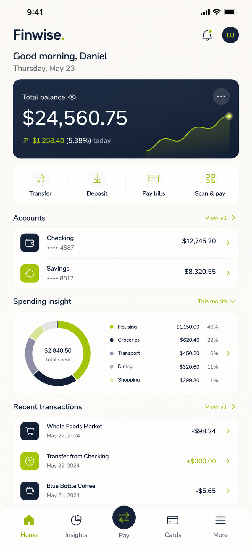
Independent product initiative · Fintech

Finwise makes everyday banking feel clear and reassuring.

Project overview

A mobile banking experience that turns financial complexity into confident everyday decisions.

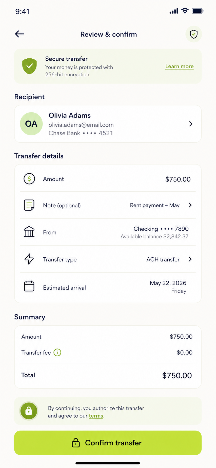
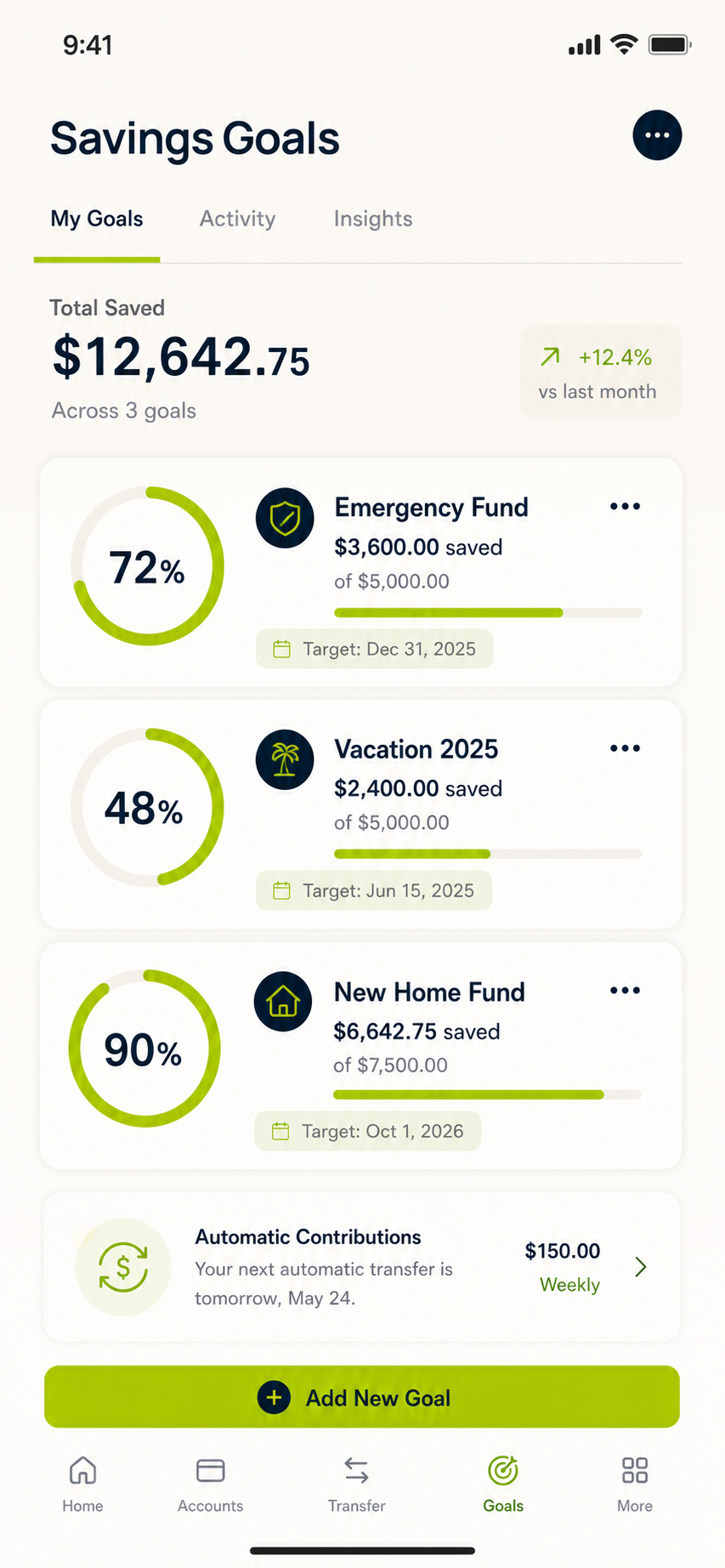
Finwise explores how a calm, accessible product experience can help people understand spending, transfer money safely, and build stronger savings habits.

My role

Lead Product Designer

I led the initiative from discovery through high-fidelity product design, connecting research insights to the interaction model and visual system.

Responsibilities

End-to-end product design

Research synthesis, competitive analysis, information architecture, user flows, wireframing, interaction design, prototyping, usability evaluation, accessibility, and design-system foundations.

Timeline & deliverables

12 weeks · iOS & Android

Research plan, persona, journey map, core task flows, wireframes, interactive prototype, six key product screens, testing insights, and scalable UI foundations.

About the app

Everyday banking designed around understanding, not feature density.

Finwise brings balances, spending insights, secure transfers, and savings goals into one focused mobile experience. The product uses plain language and proactive guidance to help people make informed decisions without requiring financial expertise.

!
The challenge

Banking tools often make simple decisions feel complicated.

Competitive analysis showed that many banking apps prioritize feature density over confidence, leaving users uncertain about spending, transfers, and progress toward savings goals. Finwise needed to simplify high-frequency tasks while communicating trust at every step.

Research synthesis

Three needs shaped the product direction.

01

See the full picture

People need an immediate, understandable view of balances, upcoming payments, and recent activity.

02

Act with confidence

Transfers need transparent confirmation, clear status, and guardrails that reduce costly mistakes.

03

Make progress visible

Savings feels more motivating when goals, momentum, and next actions are easy to understand.

My approach

Understand, frame, explore, validate, and refine.

I moved from competitive analysis and research synthesis into journey mapping, task flows, wireframing, interactive prototyping, and usability evaluation. Each phase narrowed uncertainty and translated user needs into clear product decisions.

Research summary

Confidence matters more than feature count.

Finding 01

Fragmented visibility

People move between multiple screens to understand balances, transactions, and upcoming payments.

Finding 02

Unclear consequences

Financial actions create anxiety when fees, timing, and confirmation states are difficult to understand.

Finding 03

Passive insights

Charts feel less valuable when they do not connect directly to a clear next action.

User personas

Three financial mindsets shaped the product.

MT
Maya ThompsonBusy professional · 32

Actively manages her money but finds traditional banking tools fragmented and overly technical.

Goals
  • Understand spending quickly
  • Move money without mistakes
  • Build an emergency fund
Frustrations
  • Financial jargon
  • Hidden fees and unclear timing
  • Disconnected dashboards
“Show me what matters and what I should do next.”
EM
Elijah MorganFreelance creative · 28

Manages variable monthly income and needs a reliable way to plan bills, taxes, and savings.

Goals
  • Plan around irregular income
  • Separate taxes automatically
  • Avoid overdrafts
Frustrations
  • Unpredictable cash flow
  • Rigid budgeting tools
  • Late payment anxiety
“Help me prepare for the months that look different.”
SR
Sofia RamirezNew graduate · 23

Wants to establish healthy financial habits while learning how credit, savings, and budgeting work.

Goals
  • Build consistent savings habits
  • Understand credit clearly
  • Stay within a simple budget
Frustrations
  • Overwhelming financial advice
  • Fear of costly mistakes
  • No visible sense of progress
“Make money management feel less intimidating.”
Empathy map

Understanding what Maya thinks, feels, says, and does.

MayaBusy professional building financial confidence
Thinks & feels
  • “Am I making the right decision?”
  • Motivated but occasionally overwhelmed
  • Worries about missing important details
Sees
  • Dense dashboards and financial jargon
  • Multiple accounts across institutions
  • Advice that rarely feels actionable
Says & does
  • Checks balances several times a week
  • Manually tracks savings progress
  • “I want a simple view without losing detail.”
Hears
  • Friends recommending budgeting apps
  • Warnings about unexpected fees
  • Advice to automate savings
Pains

Hidden fees, unclear timing, fragmented information, anxiety before confirming actions.

Gains

Clear next steps, visible progress, trustworthy confirmation, and calm financial control.

Customer journey map

From checking finances to taking confident action.

StageOpen appReview activityUnderstand insightTake actionConfirm outcome
User actionSigns in and scans balanceChecks recent transactionsReviews spending signalTransfers or adjusts goalVerifies successful status
Thoughts“Where do I stand?”“Does anything look wrong?”“What should I change?”“Is this safe to submit?”“Did everything work?”
Emotion●●●○○●●○○○●●●○○●●○○○●●●●○
Pain pointToo much informationHard-to-scan activityPassive chartsUnclear fees and timingWeak confirmation
OpportunityFocused overviewSmart categorizationActionable insightTransparent reviewReassuring status
Information architecture / user flow

Simple paths organized around everyday financial decisions.

HomeAccountsTransaction detailsInsightsRecommended actionTransferReviewConfirmationSavingsGoal detailsContribution
Low-fidelity wireframes · key screens

Testing complete task structure before visual polish.

Account overview
Transfer review
Savings goals
Design system

Accessible foundations designed to scale.

Color tokens

Navy supports trust, lime highlights action, and warm neutrals reduce visual fatigue.

Typography scale
Display 40Heading 28Body 16Caption 12
Buttons & states
Inputs
Cards
Insight

Dining spend is down 12%

Accessibility
  • WCAG AA contrast
  • 44px minimum targets
  • Semantic status language
  • Never color alone
Usability testing insights

Each iteration reduced uncertainty at critical moments.

Transfer flow

Show consequences early

Participants wanted fees, arrival timing, and recipient verification before confirming.

Dashboard

Prioritize one insight

Reducing chart density made the most useful spending signal easier to understand.

Accessibility

Support fast scanning

Clearer labels, stronger contrast, and consistent hierarchy improved task confidence.

The solution

A calm, focused experience that explains what happens next.

The final direction pairs a clear account overview with contextual insights, transparent transfer confirmation, and visible savings progress. Consistent hierarchy and accessible interaction patterns help people act with confidence.

Final mobile experience

Final Mobile Experience.

Try the core Finwise experience.

Explore the account dashboard, complete a secure transfer, contribute to a savings goal, and review spending insights.

01 · Check balance02 · Transfer funds03 · Add to savings
Tools

A focused toolkit supporting the full product lifecycle.

FigmaFigJamMiroMazeProtopieNotion
Prototype testing

Testing indicated stronger confidence when the interface explained what happens next.

01

Clarify transfer states

Added recipient verification, fee visibility, and a plain-language confirmation summary before submission.

02

Prioritize actionable insights

Reduced dashboard chart density and surfaced one meaningful spending insight at a time.

03

Support accessible scanning

Improved contrast, simplified labels, and created consistent information hierarchy across flows.

Impact & outcomes

Designed to improve confidence, speed, and financial clarity.

30%Target reduction in transfer completion time
25%Target increase in savings-goal engagement
AAAccessibility target across critical flows
Next project

Explore more product design work.

Back to selected work ↗